사람은 눈이라는 지각통로를 통해 세싱을 인지한다. 세상은 수 많은 색과 빛으로 구성되어 있고, 사람은 색이나 빛을 나타낼 수 있는 도구를 개발해 오고 있다. 사람들은 색이나 빛을 몇가지나 사용하고 있나? 좀 더 나아간다면 물질들은 어떻게 색이나 빛을 낼 수 있나? 크레용은 어떻게 만들어지고, 잉크는 어떻게 만들어지며, 사진은 어떻게 발달해 오고, 영화나 TV의 빛[색]은 어떻게 만들어지나? 휴대폰의 screen은 어떻게 색과 형태를 나타낼 수 있나? 화장품의 색조는 어떻게 만들어지고, 천의 염색은 어떻게 하나? 더 들어가서 천체의 빛으로 무엇을 알 수 있나? 자신의 삶에 조금이라도 의욕이 있다면, 과학이라는 이름으로, 산업이라는 이름으로 빛과 색을 나타내는 방법은 엄청 진화하고 발달하고 있음에 관심이 발동할 것이다. 수동적으로 받아들여지도록 교육받거나 삶을 꾸린 사람들도 흥미를 가지게 될 것이 뻔하다. 정원장영어는 언어로써 영어를 뛰어넘어 관심, 흥미, 재미, 성취감을 가지게 하는 곳, 꿈꾸는 미래의 달성가능한 지점을 지향하고 있다.
'Rain falls in the desert' 서울대생 해석은?
[출처] 본 기사는 조선닷컴에서 작성된 기사 입니다
['디저트에 빗물이 떨어진다' desert·dessert 구분못해 오역]
- 신입생 텝스점수 2년새 54점 추락
영어가 전공인 영어교육과생도 857→759점 100점 가까이 하락
"기본적 영어수업 못따라올지경"
'디저트는 달빛을 받으면 특히 아름다워 보인다.'
서울대에서 신입생을 대상으로 교양 영어를 가르치는 김모(40) 교수는 학생들이 제출한 리포트를 평가하다가 이런 어색한 표현을 발견했다. 영어 원문을 찾아보니 'The desert looks especially beautiful in moonlight(달빛을 받은 사막은 아름답게 보인다)'였다. 사막(desert)을 '디저트(dessert)'로 오역한 것이다.
그다음 문장 번역도 '디저트에도 때론 빗물이 떨어진다(Sometimes rain falls in the desert)'고 돼 있었다. 김 교수는 "한글로 써도 이상한 문장을 버젓이 리포트로 제출해서 깜짝 놀랐다"며 "이 학생뿐 아니라 기본적인 영어 수업을 못 따라오는 신입생들이 많아졌다"고 말했다.
|
위와 같은 결과를 초래한 원인은 어디에 있을까? 어떤 기관이나 담당자들이 이러한 결과가 나오도록 심대한 영향을 끼쳤을까? 굳이 정원장이 여기서 입으로 말을 안해도 회원 여러분들은 여태까지 공개한 정원장의 글을 통해 짐작하고도 남음이 있을 것입니다.
본론으로 돌아가겠습니다.
색과 빛은 인간의 생활에 중대한 영향을 미칩니다. '아름다움'을 나타내는 무수한 단어들도 이와 무관하지 않습니다. 그런데 대한민국의 교육계는 색과 빛에 대한 교육을 여태 어떻게 했는지 되돌아 보고 새로운 발전 방안을 강구해야 합니다. 단순한 색의 종류를 알게하는 수준에서 벗어나 '색과 빛이 주는 심리적 차이와 색과 빛을 어떻게 산업과 일상생활에 적용해 왔는지?'까지 다루고 어떻게 응용이나 활용이 가능한지에 대한 의구심이나 관심을 자극한다면 대한민국의 미래를 책임질 학생들에게 더 밝은 미래에 대한 청사진을 꿈꾸게 할 수 있지 않을까요?
1. How many colors do you know?
정원장의 저학년 학창시절 선생님들은 이런 말씀을 하신 적이 있습니다. "한국말에는 '노랗다'를 나타내는 말이 무척 많다. 누렇다, 누리끼리하다, 샛노랗다 등. 그런데 영어에는 색깔을 나타내는 말이 많지 않다. 이렇게 우리말이 영어보다 더 낫다." 정원장은 생각했습니다. "과연 그럴까?" 그때 이것에 대한 답을 올바로 해 줄 수 있는 분들이나 서적이 정원장의 가까이에는 없었습니다. 그러나 이제 회원 여러분들은 그러한 잘못된 엉터리 교육의 희생자가 되지 않을 것입니다. 영어에도 우리말 못지 않게 많은 '노랗다'를 나타내는 어휘가 있다는 사실을 알게 될 것이기 때문입니다. 다른 색깔들에 대한 표현도 마찬가지 입니다.
아래에서 영어에서는 노란색이 어떻게 표현되는지 알아봅시다. [일부만 공개합니다]
| Yellow-Orange | 34 | 74 | 100 | 255 | 174 | 66 | #FFAE42[4] | | | Maize | 44 | 70 | 95 | 242 | 198 | 73 | #F2C649[5] | Same color as "Gold Ochre" (1903–1958). One of eight colors "retired" in 1990.[2] | | Orange-Yellow | 45 | 58 | 97 | 248 | 213 | 104 | #F8D568[4] | One of eight colors "retired" in 1990.[2] | | Goldenrod | 45 | 59 | 99 | 252 | 214 | 103 | #FCD667[4] | Same color as "Medium Chrome Yellow" (1903–1910) and "Medium Yellow" (1903–1958).[2] | | Yellow | 52 | 55 | 98 | 251 | 232 | 112 | #FBE870[4] | | | Green-Yellow | 54 | 44 | 95 | 241 | 231 | 136 | #F1E788[4] | | Spring Green | 59 | 20 | 93 | 236 | 235 | 189 | #ECEBBD[4] | | | Olive Green | 59 | 49 | 71 | 181 | 179 | 92 | #B5B35C[4] | | | Lemon Yellow | 60 | 38 | 100 | 255 | 255 | 159 | #FFFF9F[5] | Same color as "Light Yellow" (1903–1958). One of eight colors "retired" in 1990.[2] | | Yellow-Green |
노란, 노랑, 노란색을 표현하는 방식이 이렇게 많군요.
|
-ish : yellowish 노리꾸리무리한 bright yellow dark yellow pale yellow 연노랑 바로 위의 네가지 표현은 어렵지 않게 접할 수 있는 표현입니다.
|
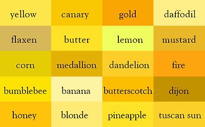
노란색 종류들로 활용할 수 있는 것들 이군요! 단순히 물질로서 여러분의 머리에 남아 있는 것이 아니라 색깔로도 각인되어 있어야 합니다. 일상에서 접하는 물질들을 색깔로 이용해서 나타낼 수 있다는 것을 알려주는 영어교육자들도 많지는 않습니다.
아래의 표현들도 참조하시길! yellow-daisy-like flowers yellow-plum-like fruit
yellow like cheese
yellow(ish) snot like discharge
snot  /ˈsnɑ:t/ noun /ˈsnɑ:t/ noun plural snots informal + impolite 1 [ noncount] : mucus from the nose 코에서 나오는 점액 <<콧물>> ▪ Snot was dripping from his nose. 2 [ count] disapproving : a rude and annoying person 무례하고 짜증 나게 하는 사람 <<버릇없는 사람>> ▪ an obnoxious little snot
discharge count] : a liquid or gas that flows out of something 어떤 것에서 흘러나오는 액체·가스 <<배출물, 배출가스>>
▪ a clear discharge from the nose and eyes ▪ nasal discharges
|
|
1] Colors
What is your favorite color? What color do you like best[most]?


하나 하나씩 가리키며, What color is this?라고 물으며.
Everybody, repeat after me!
Let me know what color the background is and what color the oval is.

Would youj tell me the color of this balloon?

Which is red?

중략
[1] 무지개빛 색의 한계를 넘어서

Scientists discover eighth colour of the rainbow
New 'shade' was found by firing packets of light through a cloud of supercold sodium atoms and through a string of carbon nanotubes

Discovery could have wide-ranging implications on the nature of military camouflage Scientists have identified an invisible eighth colour in the rainbow, a discovery that could have wide-ranging implications on the nature of military camouflage and modern espionage.
It's after noon... so check the date
The discovery of the new 'basic' colour in the spectrum of light was made by physicists at the Randall Monroe University in West Virginia, who were investigating the properties of ‘slow light’; packets of photons that are fired through a cloud of ultracold sodium atoms, colliding with the light and slowing it to roughly 17mph.
This light was then funnelled through a series of carbon nanotubes in which the angle of incidence (the measure of how far the light beam deviates from aiming ‘straight on’) was enough to bounce the photos back on themselves, effectively ‘bunching’ the light waves together.
“Really, all it took was a bit of lateral thinking,” said Dr Flora Padyolis, a professor in elementary wave physics at the institution and a lead author on the new study. “If you imagine the spectrum of visible light as analogous to sound waves with each named colour corresponding to a musical note, then what we’ve done is to approach the problem from an entirely new angle, taking what people previously thought was a C natural and listening to it like a B sharp,” she said.
과학이란 것도 믿을 것이 못된다. 무지개 색이 6가지라는 것에서부터 7가지라는 정설에 이르기까지. 그냥 빛과 눈의 조화로 인정하면 그만이지만.
People in some cultures say a rainbow only has two or three colors. Germans say rainbows have five colors. English-speaking navties say rainbows have six colors. And Koreans say rainbows have seven colors.
But Rainbows are breathtaking — they actually contain hundreds of subtle colors. You can stare for ages and not see them all.
왜 이렇게 무지개의색깔에 대한 인식이 다르고 현재의 과학은 과거의 과학과 무엇이 달라서 무지개가 수백가지의 색을 가지고 있다고 말하는가? 회원 여러분에게 던지는 질문입니다. 너무나 뻔하지만.


1) Spectrum
인간이 볼 수 있는 가시광선너머엔 무엇이 존재하는지 알게 된 것은 아주 오래전의 일이 아니다. 가시광선밖에 있는 것들에 대해 알게 되면서 세상의 과학은 급속히 변모하여 발전하기 시작했다. 천문학, 의학 등 산업 전반에 걸쳐서. 색[빛]과 산업의 관계에 대해 어릴적 부터 흥미을 가지게 하는 것은 대한민국 경제발전을 위한 중요한 토대가 될 것이다. X-ray, Microwave 와 같은 어휘는 대체로 익숙한 편이다. 누구나 어떻게 활용되고 있는지도 좀은 알고 있다. '인간이 보지 못하는 색을 다른 동물들은 볼 수 있는가?'라는 질문도 재미있을 것이다. 단순히 질문의 범위를 지나서 유전공학과 관련된다면 새로운 차원의 관심거리로 만들어진다.
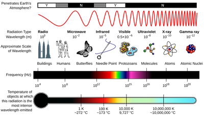
In the 17th century the word spectrum was introduced into optics by Isaac Newton, referring to the range of colors observed when white light was dispersed through a prism. Soon the term referred to a plot of light intensity or power as a function of frequency or wavelength, also known as a spectral density plot.
The term spectrum was expanded to apply to other waves, such as sound waves that could also be measured as a function of frequency, frequency spectrum and power spectrum of a signal. The term now applies to any signal that can be measured or decomposed along a continuous variable such as energy in electron spectroscopy or mass to charge ratio in mass spectrometry. Spectrum is also used to refer to a graphical representation of the signal as a function of the dependent variable.
Newton and the Color Spectrum
  | The diagram from Sir Isaac Newton’s crucial experiment, 1666-72. A ray of light is divided into its constituent colors by the first prism (left), and the resulting bundle of colred rays is reconstituted into white light by the second. |
Our modern understanding of light and color begins with Isaac Newton (1642-1726) and a series of experiments that he publishes in 1672. He is the first to understand the rainbow — he refracts white light with a prism, resolving it into its component colors: red, orange, yellow, green, blue and violet.
In the late 1660s, Newton starts experimenting with his ’celebrated phenomenon of colors.’ At the time, people thought that color was a mixture of light and darkness, and that prisms colored light. Hooke was a proponent of this theory of color, and had a scale that went from brilliant red, which was pure white light with the least amount of darkness added, to dull blue, the last step before black, which was the complete extinction of light by darkness. Newton realizes this theory was false.

Light enters the prism from the top right, and is refracted by the glass. The violet is bent more than the yellow and red, so the colors separate.
Newton set up a prism near his window, and projected a beautiful spectrum 22 feet onto the far wall. Further, to prove that the prism was not coloring the light, he refracted the light back together.
Artists were fascinated by Newton’s clear demonstration that light alone was responsible for color. His most useful idea for artists was his conceptual arrangement of colors around the circumference of a circle (right), which allowed the painters’ primaries (red, yellow, blue) to be arranged opposite their complementary colors (e.g. red opposite green), as a way of denoting that each complementary would enhance the other’s effect through optical contrast.
Unable to represent spectral red with any pigment, Boutet substituted two reds – fire-red and crimson – omitting one of Newton’s two blues. To compound the confusion, the colorist evidently misread two of the labels, “orange” and “violet.”
중략
[2] eye and color perceptiion
인간의 눈은 어떻게 색[빛]을 지각하는가? 얼마만큼 많은 색을 알아볼 수 있는가?
Physiology of color perception The modern model of human color perception as it occurs in the retina, pertaining to both the trichromatic and opponent process theories introduced in the 19th century.  Normalized response spectra of human cones, to monochromatic spectral stimuli, with wavelength given in nanometers.  The same figures as above represented here as a single curve in three (normalized cone response) dimensions  Relative brightness sensitivity of the human visual system as a function of wavelength Perception of color begins with specialized retinal cells containing pigments with different spectral sensitivities, known as cone cells. In humans, there are three types of cones sensitive to three different spectra, resulting in trichromatic color vision. Each individual cone contains pigments composed of opsin apoprotein, which is covalently linked to either 11-cis-hydroretinal or more rarely 11-cis-dehydroretinal.[2] The cones are conventionally labeled according to the ordering of the wavelengths of the peaks of their spectral sensitivities: short (S), medium (M), and long (L) cone types. These three types do not correspond well to particular colors as we know them. Rather, the perception of color is achieved by a complex process that starts with the differential output of these cells in the retina and it will be finalized in the visual cortex and associative areas of the brain. For example, while the L cones have been referred to simply as red receptors, microspectrophotometry has shown that their peak sensitivity is in the greenish-yellow region of the spectrum. Similarly, the S- and M-cones do not directly correspond to blue and green, although they are often described as such. The RGB color model, therefore, is a convenient means for representing color, but is not directly based on the types of cones in the human eye. The peak response of human cone cells varies, even among individuals with so-called normal color vision;[3] in some non-human species this polymorphic variation is even greater, and it may well be adaptive.[4] TheoriesTwo complementary theories of color vision are the trichromatic theory and the opponent process theory. The trichromatic theory, or Young–Helmholtz theory, proposed in the 19th century by Thomas Young and Hermann von Helmholtz, as mentioned above, states that the retina's three types of cones are preferentially sensitive to blue, green, and red. Ewald Hering proposed the opponent process theory in 1872.[5] It states that the visual system interprets color in an antagonistic way: red vs. green, blue vs. yellow, black vs. white. Both theories are now accepted as valid, describing different stages in visual physiology, visualized in the diagram on the right.[6] Green ←→ Magenta and Blue ←→ Yellow are scales with mutually exclusive boundaries. In the same way that there cannot exist a "slightly negative" positive number, a single eye cannot perceive a blueish-yellow or a reddish-green. (But such impossible colors can be perceived due to binocular rivalry.) Cone cells in the human eye| Cone type | Name | Range | Peak wavelength[7][8] |
|---|
| S | β | 400–500 nm | 420–440 nm | | M | γ | 450–630 nm | 534–555 nm | | L | ρ | 500–700 nm | 564–580 nm |
A range of wavelengths of light stimulates each of these receptor types to varying degrees. Yellowish-green light, for example, stimulates both L and M cones equally strongly, but only stimulates S-cones weakly. Red light, on the other hand, stimulates L cones much more than M cones, and S cones hardly at all; blue-green light stimulates M cones more than L cones, and S cones a bit more strongly, and is also the peak stimulant for rod cells; and blue light stimulates S cones more strongly than red or green light, but L and M cones more weakly. The brain combines the information from each type of receptor to give rise to different perceptions of different wavelengths of light. The opsins (photopigments) present in the L and M cones are encoded on the X chromosome; defective encoding of these leads to the two most common forms of color blindness. The OPN1LW gene, which codes for the opsin present in the L cones, is highly polymorphic (a recent study by Verrelli and Tishkoff found 85 variants in a sample of 236 men).[9] A very small percentage of women may have an extra type of color receptor because they have different alleles for the gene for the L opsin on each X chromosome. X chromosome inactivation means that only one opsin is expressed in each cone cell, and some women may therefore show a degree of tetrachromatic color vision.[10] Variations in OPN1MW, which codes the opsin expressed in M cones, appear to be rare, and the observed variants have no effect on spectral sensitivity. Color in the human brainColor processing begins at a very early level in the visual system (even within the retina) through initial color opponent mechanisms. Both Helmholtz's trichromatic theory, and Hering's opponent process theory are therefore correct, but trichromacy arises at the level of the receptors, and opponent processes arise at the level of retinal ganglion cells and beyond. In Hering's theory opponent mechanisms refer to the opposing color effect of red–green, blue–yellow, and light–dark. However, in the visual system, it is the activity of the different receptor types that are opposed. Some midget retinal ganglion cells oppose L and M cone activity, which corresponds loosely to red–green opponency, but actually runs along an axis from blue-green to magenta. Small bistratified retinal ganglion cells oppose input from the S cones to input from the L and M cones. This is often thought to correspond to blue–yellow opponency, but actually runs along a color axis from lime green to violet. Visual information is then sent to the brain from retinal ganglion cells via the optic nerve to the optic chiasma: a point where the two optic nerves meet and information from the temporal (contralateral) visual field crosses to the other side of the brain. After the optic chiasma the visual tracts are referred to as the optic tracts, which enter the thalamus to synapse at the lateral geniculate nucleus (LGN). The lateral geniculate nucleus is divided into laminae (zones), of which there are three types: the M-laminae, consisting primarily of M-cells, the P-laminae, consisting primarily of P-cells, and the koniocellular laminae. M- and P-cells receive relatively balanced input from both L- and M-cones throughout most of the retina, although this seems to not be the case at the fovea, with midget cells synapsing in the P-laminae. The koniocellular laminae receive axons from the small bistratified ganglion cells.[11][12] After synapsing at the LGN, the visual tract continues on back to the primary visual cortex (V1) located at the back of the brain within the occipital lobe. Within V1 there is a distinct band (striation). This is also referred to as "striate cortex", with other cortical visual regions referred to collectively as "extrastriate cortex". It is at this stage that color processing becomes much more complicated. In V1 the simple three-color segregation begins to break down. Many cells in V1 respond to some parts of the spectrum better than others, but this "color tuning" is often different depending on the adaptation state of the visual system. A given cell that might respond best to long wavelength light if the light is relatively bright might then become responsive to all wavelengths if the stimulus is relatively dim. Because the color tuning of these cells is not stable, some believe that a different, relatively small, population of neurons in V1 is responsible for color vision. These specialized "color cells" often have receptive fields that can compute local cone ratios. Such "double-opponent" cells were initially described in the goldfish retina by Nigel Daw;[13][14] their existence in primates was suggested by David H. Hubel and Torsten Wiesel and subsequently proven by Bevil Conway.[15] As Margaret Livingstone and David Hubel showed, double opponent cells are clustered within localized regions of V1 called blobs, and are thought to come in two flavors, red–green and blue–yellow.[16] Red–green cells compare the relative amounts of red–green in one part of a scene with the amount of red–green in an adjacent part of the scene, responding best to local color contrast (red next to green). Modeling studies have shown that double-opponent cells are ideal candidates for the neural machinery of color constancy explained by Edwin H. Land in his retinex theory.[17]  This image (when viewed in full size, 1000 pixels wide) contains 1 million pixels, each of a different color. The human eye can distinguish about 10 million different colors. [18]From the V1 blobs, color information is sent to cells in the second visual area, V2. The cells in V2 that are most strongly color tuned are clustered in the "thin stripes" that, like the blobs in V1, stain for the enzyme cytochrome oxidase (separating the thin stripes are interstripes and thick stripes, which seem to be concerned with other visual information like motion and high-resolution form). Neurons in V2 then synapse onto cells in the extended V4. This area includes not only V4, but two other areas in the posterior inferior temporal cortex, anterior to area V3, the dorsal posterior inferior temporal cortex, and posterior TEO.[19][20] Area V4 was initially suggested by Semir Zeki to be exclusively dedicated to color, but this is now thought to be incorrect.[21] In particular, the presence in V4 of orientation-selective cells led to the view that V4 is involved in processing both color and form associated with color.[22] Color processing in the extended V4 occurs in millimeter-sized color modules called globs.[19][20] This is the first part of the brain in which color is processed in terms of the full range of hues found in color space.[19][20] Anatomical studies have shown that neurons in extended V4 provide input to the inferior temporal lobe . "IT" cortex is thought to integrate color information with shape and form, although it has been difficult to define the appropriate criteria for this claim. Despite this murkiness, it has been useful to characterize this pathway (V1 > V2 > V4 > IT) as the ventral stream or the "what pathway", distinguished from the dorsal stream ("where pathway") that is thought to analyze motion, among many other features. Subjectivity of color perceptionNothing categorically distinguishes the visible spectrum of electromagnetic radiation from invisible portions of the broader spectrum. In this sense, color is not a property of electromagnetic radiation, but a feature of visual perception by an observer. Furthermore, there is an arbitrary mapping between wavelengths of light in the visual spectrum and human experiences of color. Although most people are assumed to have the same mapping, the philosopher John Locke recognized that alternatives are possible, and described one such hypothetical case with the "inverted spectrum" thought experiment. For example, someone with an inverted spectrum might experience green while seeing 'red' (700 nm) light, and experience red while seeing 'green' (530 nm) light. Synesthesia (or ideasthesia) provides some atypical but illuminating examples of subjective color experience triggered by input that is not even light, such as sounds or shapes. The possibility of a clean dissociation between color experience from properties of the world reveals that color is a subjective psychological phenomenon. The Himba people have been found to categorize colors differently from most Euro-Americans and are able to easily distinguish close shades of green, barely discernible for most people.[23] The Himba have created a very different color scheme which divides the spectrum to dark shades (zuzu in Himba), very light (vapa), vivid blue and green (buru) and dry colors as an adaptation to their specific way of life. Perception of color depends heavily on the context in which the perceived object is presented. For example, a white page under blue, pink, or purple light will reflect mostly blue, pink, or purple light to the eye, respectively; the brain, however, compensates for the effect of lighting (based on the color shift of surrounding objects) and is more likely to interpret the page as white under all three conditions, a phenomenon known as color constancy.
|
중략
[2] colors' ingredients[pigments]
물질이 어떤 색깔을 가지기위해서는 어떤 특정한 색을 띨 수 있는 물질을 함유하고 있어야 한다. 어떤 물질들이 특정한 색을 가지게 하는데 사용되는가?
1) yellow
노란색은 어떤 물질들로 부터 얻어지는 것일까?
Minerals and chemistryPigments Yellow ochre quarry in Roussillon, France - Yellow ochre (also known as Mars yellow, Pigment yellow 42, 43),[37] hydrated ferric oxide (Fe
2O
3.H
2O), is a naturally occurring pigment found in clays in many parts of the world. It is non-toxic and has been used in painting since prehistoric times.[38] - Indian yellow is a transparent, fluorescent pigment used in oil paintings and watercolors. Originally magnesium euxanthate, it was claimed to have been produced from the urine of Indian cows fed only on mango leaves.[39] It has now been replaced by synthetic Indian yellow hue.
- Naples Yellow (lead antimonate yellow) is one of the oldest synthetic pigments, derived from the mineral bindheimite and used extensively up to the 20th century.[40] It is toxic and nowadays is replaced in paint by a mixture of modern pigments.
- Cadmium Yellow (cadmium sulfide, CdS) has been used in artists' paints since the mid-19th century.[41] Because of its toxicity, it may nowadays be replaced by azo pigments.
- Chrome Yellow (lead chromate, PbCrO
4), derived from the mineral crocoite, was used by artists in the earlier part of the 19th century, but has been largely replaced by other yellow pigments because of the toxicity of lead.[42] - Zinc yellow or zinc chromate is a synthetic pigment made in the 19th century, and used by the painter Georges Seurat in his pointilist paintings. He did not know that it was highly unstable, and would quickly turn brown.
- Titanium Yellow (nickel antimony titanium yellow rutile, NiO.Sb
2O
5.20TiO
2) is created by adding small amounts of the oxides of nickel and antimony to titanium dioxide and heating. It is used to produce yellow paints with good white coverage and has the LBNL paint code "Y10".[43] - Gamboge is an orange-brown resin, derived from trees of the genus Garcinia, which becomes yellow when powdered.[44] It was used as a watercolor pigment in the far east from the 8th century – the name "gamboge" is derived from "Cambodia" – and has been used in Europe since the 17th century.[45]
- Orpiment, also called King's Yellow or Chinese Yellow is arsenic trisulfide (As
2S
3) and was used as a paint pigment until the 19th century when, because of its high toxicity and reaction with lead-based pigments, it was generally replaced by Cadmium Yellow.[46] - Azo-dye based pigment (a brightly colored transparent or semitransparent dye with a white pigment) is used as the colorant in most modern paints requiring either a highly saturated yellow or simplicity of color mixing. The most common is the monoazo arylide yellow family, first marketed as Hansa Yellow.
Dyes- Curcuma longa, also known as turmeric, is a plant grown in India and Southeast Asia which serves as a dye for clothing, especially monks' robes; as a spice for curry and other dishes; and as a popular medicine. It is also used as a food coloring for mustard and other products.[47]
- Saffron, like turmeric, is one of the rare dyes that is also a spice and food colorant. It is made from the dried red stigma of the crocus sativus flower. It must be picked by hand and it takes 150 flowers to obtain a single gram of stigma, so it is extremely expensive. It probably originated in the Mediterranean or Southwest Asia, and its use was detailed in a 7th-century BC Assyrian botanical reference compiled under Ashurbanipal. It was known in India at the time of the Buddha, and after his death his followers decreed that monks should wear robes the color of saffron. Saffron was used to dye the robes of the senior Buddhist monks, while ordinary monks wore robes dyed with Gamboge or Curcuma longa, also known as Turmeric.
The color of saffron comes from crocin, a red variety of carotenoid natural pigment. The color of the dyed fabric varies from deep red to orange to yellow, depending upon the type of saffron and the process. Most saffron today comes from Iran, but it is also grown commercially in Spain, Italy and Kashmir in India, and as a boutique crop in New Zealand, the United Kingdom, France, Switzerland and other countries. In the United States, it has been cultivated by the Pennsylvania Dutch community since the early 18th century. Because of the high price of saffron, other similar dyes and spices are often sold under the name saffron; for instance, what is called Indian saffron is often really turmeric. - Reseda luteola, also known as dyers weed, yellow weed or weld, has been used as a yellow dye from neolithic times. It grew wild along the roads and walls of Europe, and was introduced into North America, where it grows as a weed. It was used as both as a yellow dye, whose color was deep and lasting, and to dye fabric green, first by dyeing it blue with indigo, then dyeing it with reseda luteola to turn it a rich, solid and lasting green. It was the most common yellow dye in Europe from the Middle Ages until the 18th century, when it was replaced first by the bark of the quercitron tree from North America, then by synthetic dyes. It was also widely used in North Africa and in the Ottoman Empire.[49]
- Gamboge is a deep saffron to mustard yellow pigment and dye.[50] In Asia, it is frequently used to dye Buddhist monks' robes.[51][52] Gamboge is most often extracted by tapping resin from various species of evergreen trees of the family Guttiferae, which grow in Cambodia, Thailand, and elsewhere in Southeast Asia.[53] "Kambuj" (Sanskrit: कंबुज) is the ancient Sanskrit name for Cambodia.
Orpiment was a source of yellow pigment from ancient Egypt through the 19th century, though it is highly toxic. Curcuma longa, also known as Turmeric, has been used for centuries in India as a dye, particularly for monk's robes. it is also commonly used as a medicine and as a spice in Indian cooking. Reseda luteola, also known as dyers weed, yellow weed or weld, was the most popular source of yellow dye in Europe from the Middle Ages through the 18th century. The Garcinia tree of Southeast Asia, whose resin is used to make the yellow dye called gamboge. Reflectance spectra of yellow pigments, as a percentage of white (Abney 1891) Structure of Titan yellow
|
중략
[4] crayon and colors
크레용 색깔의 가짓수도 점차 많아졌다. 눈으로 본 것을 여러가지 색깔로 표현하고 싶은 인간의 욕구와 크레용의 색을 각각 만들수 있는 지식의 축척이 가져온 결과이다.
American crayon companies
The initial era of wax crayons saw a number of companies and products competing for the lucrative education and artist markets. In addition to the giants such as Binney & Smith/Crayola and American Crayon/Dixon Ticonderoga, other companies popped up in the industry at various times from the late 19th century to the early 1910s.
Binney & Smith (Crayola)
Binney & Smith Company (later to be named Crayola LLC) developed their own famous line of wax crayons beginning on June 10, 1903.[9] Edwin Binney and C. Harold Smith had been long established in the coloring marketplace through Binney’s Peekskill, NY chemical works factory making lampblack by burning whale and carbon black and later instrumental in the coloring of automobile tires.
In 1902 they developed and introduced the Staonal marking crayon. Edwin Binney, working with his wife, Alice Stead Binney, came up with their famous Crayola brand of crayons. Alice came up with the name Crayola by combining the French word for chalk, craie, with the first part of oleaginous, the oily paraffin wax used to make the crayon.[10]
Binney and Smith were quick to capitalize on their creation by offering 19 different boxes with 30 different colors including the Crayola No 51 which, with 28, featured their largest selection of colors.[11] The Rubens Crayola line started in 1903 as well (not in the 1920s as previously documented by many sources)[12] was directly targeted toward artists and designed to compete with the Raphael brand of crayons out of Europe. Rubens were featured in everything from the small 6-color box to the No. 500 with 24 colors.[13] In addition to their highly familiar Crayola line, they also made many other crayon lines including Anti-Roll, Arista, Art-Toy, Besco, Boston, Cerata, Cerola, Chic’ago, Doo Zee, Durel, Easy-Off, Gotham, Liquitex, Munsell Crayola, Perma, Pooh, Protfolio, Rubens, Spectra, Tiny Tots, Washable and Widstrok.[14]
By far the most recognizable brand was their Crayola “Gold Medal” line in the familiar yellow boxes. The Gold Medal referred to a Gold Medal the company earned with their An-du-Septic dustless chalk during the March 1904 St. Louis World's Fair. Over 39,000 awards were given out using the medals designed by Adolph A. Weinman. Receiving a medal at an Exposition was and still is something of importance with many companies featuring their medal on their products. Two companies to use the 1904 medal were Jack Daniel's whiskey (which still use it on their bottles to this day) and Binney & Smith. They used the award to design an entirely new line of crayons featuring the medal on the front of their box.[15] Initially, they developed and introduced the No. 8 box of eight assorted colors (this famous box is usually depicted on most historical material associated with Crayola; it was even featured on a postage stamp) in early 1905[16] using the side of the medal depicting an Eagle but quickly changed to the other side showing the 1904 date their medal was won.[17] From there they began to transition and phase out other Crayola crayon boxes used earlier until eventually their entire line of Crayola crayons featured the Gold Medal design. They would use this design to identify their brand for over 50 years, permanently infusing their crayons into the consciousness of consumers and catapulting the Crayola brand into the world's leading crayon brand. The Crayola brand is currently owned by Hallmark Cards of Kansas City, Missouri.
중략
[7] ink and colors
중략
2. living things and colors
무엇이 색을 가지게 하고, 어떤 것은 표피와 속의 색깔이 다른 이유가 무엇일까?
1] Why are carrots red in color?
중략
15] Why do leaves turn red or yellow?
중략
21] camouflage [protective coloration 보호색]
One of the pioneers of research into animal coloration, Edward Bagnall Poulton[15] classified the forms of protective coloration, in a way which is still helpful. He described: protective resemblance; aggressive resemblance; adventitious protection; and variable protective resemblance.[16] These are covered in turn below.  A camouflaged orange oak leaf butterfly, Kallima inachus (centre) displays protective resemblance Protective resemblance is used by prey to avoid predation. It includes special protective resemblance, now called mimesis, where the whole animal looks like some other object, for example when a caterpillar resembles a twig or a bird dropping. In general protective resemblance, now called crypsis, the animal's texture blends with the background, for example when a moth's colour and pattern blend in with tree bark.[16] Aggressive resemblance is used by predators or parasites. In special aggressive resemblance, the animal looks like something else, luring the prey or host to approach, for example when a flower mantis resembles a particular kind of flower, such as an orchid. In general aggressive resemblance, the predator or parasite blends in with the background, for example when a leopard is hard to see in long grass.[16] For adventitious protection, an animal uses materials such as twigs, sand, or pieces of shell to conceal its outline, for example when a caddis fly larva builds a decorated case, or when a decorator crab decorates its back with seaweed, sponges and stones.[16] In variable protective resemblance,an animal such as a chameleon, flatfish, squid or octopus changes its skin pattern and colour using special chromatophore cells to resemble whatever background it is currently resting on (as well as for signalling).[16] The main mechanisms to create the resemblances described by Poulton – whether in nature or in military applications – are crypsis, blending into the background so as to become hard to see (this covers both special and general resemblance); disruptive patterning, using colour and pattern to break up the animal's outline, which relates mainly to general resemblance; mimesis, resembling other objects of no special interest to the observer, which relates to special resemblance; countershading, using graded colour to create the illusion of flatness, which relates mainly to general resemblance; and counterillumination, producing light to match the background, notably in some species of squid.[16] Countershading was first described by the American artist Abbott Handerson Thayer, a pioneer in the theory of animal coloration. Thayer observed that whereas a painter takes a flat canvas and uses coloured paint to create the illusion of solidity by painting in shadows, animals such as deer are often darkest on their backs, becoming lighter towards the belly, creating (as zoologist Hugh Cott observed) the illusion of flatness,[17] and against a matching background, of invisibility. Thayer's observation "Animals are painted by Nature, darkest on those parts which tend to be most lighted by the sky's light, and vice versa" is called Thayer's Law.[18]
|
Chameleon
|
Change of colorSome chameleon species are able to change their skin coloration. Different chameleon species are able to vary their coloration and pattern through combinations of pink, blue, red, orange, green, black, brown, light blue, yellow, turquoise, and purple.[14] Chameleon skin has a superficial layer which contains pigments, and under the layer are cells with guanine crystals. Chameleons change color by changing the space between the guanine crystals, which changes the wavelength of light reflected off the crystals which changes the color of the skin. Color change in chameleons has functions in camouflage, but most commonly in social signaling and in reactions to temperature and other conditions. The relative importance of these functions varies with the circumstances, as well as the species. Color change signals a chameleon's physiological condition and intentions to other chameleons.[15][16] Chameleons tend to show brighter colors when displaying aggressively to other chameleons,[17] and darker colors when they submit or "give up".[18] Some species, such as Smith's dwarf chameleon, adjust their colors for camouflage in accordance with the vision of the specific predator species (bird or snake) by which they are being threatened.[19] The desert-dwelling Namaqua chameleon also uses color change as an aid to thermoregulation, becoming black in the cooler morning to absorb heat more efficiently, then a lighter grey color to reflect light during the heat of the day. It may show both colors at the same time, neatly separated left from right by the spine.[citation needed] Mechanism of color changeFor a long time it was thought that chameleons change color by dispersion of pigment-containing organelles within their skin. However, research conducted in 2014 on panther chameleons has shown that pigment movement only represents part of the story.[20] Chameleons have two superimposed layers within their skin that control their color and thermoregulation. The top layer contains a lattice of guanine nanocrystals, and by exciting this lattice the spacing between the nanocrystals can be manipulated, which in turn affects which wavelengths of light are reflected and which are absorbed. Exciting the lattice increases the distance between the nanocrystals, and the skin reflects longer wavelengths of light. Thus, in a relaxed state the crystals reflect blue and green, but in an excited state the longer wavelengths such as yellow, orange, green, and red are reflected.[21] The skin of a chameleon also contains some yellow pigments, which combined with the blue reflected by a relaxed crystal lattice results in the characteristic green color which is common of many chameleons in their relaxed state. The deeper layer of skins works in a similar fashion but primarily controls the amount of near-infrared light that is absorbed or reflected, and therefore may influence thermoregulation. |
중략
3. camera, photo and colors
카메라와 사진 인화 기술의 발전과 흑백에서 지금의 칼라까지 발달하게 되는 과정은 영화나 TV를 이해하는데 도움을 줄 것이다.
중략
4. colors on movie, TV, cpmputer, and cell phone screen
screen에 어떻게 색이 구현되는가? 흥미로운 부분이 아닌가? 전파가 어떻게 형태와 색을 가질 수 있지? 유선은 또 어떤가?
중략
5. dye - 천의 염색, 머리 염색
중략
2] hairdye
[1] haircoloring / How to dye hair
중략
[2] color pigments[ingredients] in hairdye
머리 염색약의 성분이 무엇인지를 알아보는 것은 어떻게 염색약이 만들어지는지를 알 수 있는 단서가 된다.

Ingredients in Hair Color Until the early 1900s, hair coloring was made from a wide range of herbal and natural dyes. Flying in the face of other chemists who found the development of hair coloring trivial and unworthy of their time, French chemist Eugene Schuller created the first safe commercial hair coloring in 1909. His invention was based on a new chemical, paraphenylenediamine, and provided the foundation of his company, the French Harmless Hair Dye Company. A year later, the name was changed to one that is more familiar today -- L'Oreal. L'Oreal, one of the hair product giants, has grown steadily over the years; the company credits advanced and applied research of new product development and expansion into markets around the world with its global success. The two main chemical ingredients involved in any coloring process that lasts longer than 12 shampoos are:
Hydrogen peroxide (also known as the developer or oxidizing agent) -- This ingredient, in varying forms and strengths, helps initiate the color-forming process and creates longer-lasting color. The larger the volume of the developer, the greater the amount of sulfur is removed from the hair. Loss of sulfur causes hair to harden and lose weight. This is why, for the majority of hair coloring, the developer is maintained at 30% volume or less. Ammonia -- This alkaline allows for lightening by acting as a catalyst when the permanent hair color comes together with the peroxide. Like all alkalines, ammonia tends to separate the cuticle and allow the hair color to penetrate the cortex of the hair.In addition, various types of alcohols, which can also dry the hair, are present in most hair color. (Check out this official ingredient list for a hair color formula.)
|
중략
6. cosmetics
1] eyeshadow color
The Best Eyeshadow Shades to Enhance Your Eye Color


What Eyeshadow Shade Should You Be Wearing?
If the eyes are in fact the windows to our soul, we want them to be accented in the most flattering way possible, right? But … we're creatures of beauty habit and can easily get a bit lazy and fall into a make up rut. Sometimes we need a nudge to try something new and then suddenly we're like, "Why didn't I try this sooner?!"
Well, we got a little help from our friend Carol Shaw -- celebrity makeup artist and creator of makeup line LORAC, which brings red-carpet glamour into the hands of real women like us. She lent us her expertise so that we could create this quiz that'll point you to your best eye makeup shade. Based on the questions we ask you -- such as your eye color, celeb makeup icon and makeup style -- these quiz results will yield the eyeshadow shade you should be wearing. Plus we offer up both a matte and shimmer product suggestion to make your next makeup-shopping trip a breeze.
The cool thing about eye makeup products today, is that there are all sorts of eyeshadow tools -- from powders to creams -- to suit your needs. Plus, we've noticed that smoky eye makeup is no longer limited to just grays, charcoals, silvers, etc. -- now you can create that sultry look using the color that best suits you, whether it's blue, purple or an earthy tone. Once you discover your most fab eyeshadow shade, Shaw has a tip for you: The key to eyeshadow is … blending. So whether you use your finger, makeup brushes or a sponge, make sure to blend it well.
|
중략
2] fingernail or toenail coloring
[1] dye fingernails with garden balsam


요즘은 봉숭아[봉선화]로 손톱에 물들이는 분들 거의 없는 듯.
How to Dye Your Fingernails With Bongsunghwa (Impatiens Balsamina)
|
1 First, plant a bongsunghwa plant and pick some leaves and flower petals off of the plant. Or you can find someone who has a bongsunghwa plant in their garden and ask for their permission when picking the leaves.
|
2 Crush your leaves and flowers in a bowl with a pinch of alum just before it turns into a paste. (The colour doesn't matter. If you had only leaves, the mixture will turn green. And if you had flowers the mixture will turn into a purple colour.)
|
3 Preferably with a friend's help, put on adhesive plaster around the bottom of your fingernail then around the top and side. This prevents the plant from dying your skin orange as well. Do this for all the fingernails.
|
4 Place a small amount of the paste on each of your fingernails. (Ask your friend to help!)
|
5 Then cut plastic wrap into a 3"x 4" square and wrap it around your finger.
|
6 Take the rest of your plaster and wrap it around your finger.
|
7 Do this for all of your fingers.
|
8 The paste will dye your nails into a bright orange colour overnight.
|
중략
7. food and color
식용색소에 대한 관심도 건강과 관련하여 중요하다. '보기에 좋은 것이 맛이 좋다.'는 심리적 특성 또한 흥미를 자극하기에 충분하다.
중략


중략

중략
8. Painting, drawing and color / Coloring


중략
9. Culture, politics and color
중략
10. color and astronomy
중략
11. color and medicine
중략
12. harmful or toxic ingredients in color
색으로 아름다움을 가장하기위해 이용되는 제품들은 인체에 아무런 해를 끼치지 않는 걸까? 혹시 인간에게 해로운 물질들을 함유하고 있는 것은 아닌가? 어떤 독성물질들이 들어 있는가? 어떤 부작용[해, 질병]을 유발할 수 있는가? 인간에게 해를 끼치는 물질을 포함하고 있다면, 그것을 대체할 무해한 물질은 없는가? 이렇게 생각을 전개를 할 수 있기를 바라면서 회원 여러분들에게 이 자료를 공개합니다. 인간은 미를 추구할 수 밖에 없는 존재이지만, 건강에 대한 관심 또한 그것에 못지 않기 때문에, 이러한 관심을 주도할 수 있는 인재가 길러지기를 바랍니다.
중략
2] harmful or toxic ingredients in hairdye
Avoid These 7 Toxic Chemicals Found in Most Hair Dyes
After writing my article about harmful chemicals found in most commercial shampoos, it was only natural that I would want to investigate the health hazards of using commercial hair dyes. Lo and behold, my suspicions were correct—according to a European Commission report of 2006, not one hair dye brand has proven to be consumer safe. In fact, the EU Commission has already banned 22 ingredients that may still be found in many products sold outside of Europe, and the commission is in the process of investigating another 115 potentially harmful ingredients.
The side effects of those banned-in-Europe chemicals range from severe allergies, skin, eye, throat and lung irritation, and rheumatoid arthritis to cancer of the bladder. I will post the full list at the end of this article, but thought I should introduce to you some of most dangerous culprits: 1. PPD PPD is short for para-phenylenediamine. It is used as a dye for dark color shades and is made from coal tar, a petroleum-derived chemical that includes benzene,naphthalene, phenols, aniline, and other chemicals. It is also used as a wood preservative, and contact with skin is best to be avoided. Research states PPD in combination with Hydrogene Peroxide is very toxic and can lead to cancer. 2. Hydrogene Peroxide Hydrogene Peroxide is mostly used to stip the natural color away, before applying the hair dye color. It is said to change the hair structure and make it brittle stripping it of its natural luster. 3. Ammonia Ammonia is used to open up the hair’s cuticle (the outer layer of the hair) so the dyes can come into the shaft (the inside of the hair). It may produce caustic burns and lung irritation. 4. DMDM Hydantoin DMDM Hydantoin is a preservative that slowly releases the toxic formaldehyde chemical, the longer it sits on the shelves. It may cause tissue irritation and affect the immune system. DMDM Hydantoin kills off fungi, yeasts and bacteria and it’s also used in herbicides, floor waxes, polymers, color photography, latex paints, cutting oils, adhesives, copying paper, and inks. 5. Parabens The two most common parabens preservatives are Methylparabens and Propylparabens. They are widely used in hair care products and can produce severe allergies and skin irritation. 6. Lead Acetate Lead Acetate is used as a color additive for the dark shade hair dyes. It is said to cause anemia and produce neurological problems. 7. Resorcinol Resorcinol is a toxic dye that can cause scalp irritation, and is an allergen affecting the endocrine system.
The best way to avoid these harmful chemicals is to buy brands that use 100% natural hair dyes. One needs to read the label carefully though, as some brands may still mix natural dyes with chemical preservatives and other chemical dyes for a faster and longer permanence. You can also make your own using herbs and other products found at home. But this requires time and you may need to apply it frequently before achieving a darker shade of color.
|
중략
13. Further and Creative Study
1] art and color
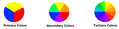
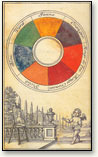
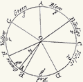
Basic Color Theory Color theory encompasses a multitude of definitions, concepts and design applications - enough to fill several encyclopedias. However, there are three basic categories of color theory that are logical and useful : The color wheel, color harmony, and the context of how colors are used. Color theories create a logical structure for color. For example, if we have an assortment of fruits and vegetables, we can organize them by color and place them on a circle that shows the colors in relation to each other. 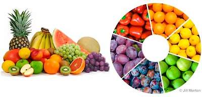
The Color WheelA color circle, based on red, yellow and blue, is traditional in the field of art. Sir Isaac Newton developed the first circular diagram of colors in 1666. Since then, scientists and artists have studied and designed numerous variations of this concept. Differences of opinion about the validity of one format over another continue to provoke debate. In reality, any color circle or color wheel which presents a logically arranged sequence of pure hues has merit. 
There are also definitions (or categories) of colors based on the color wheel. We begin with a 3-part color wheel.
Primary Colors: Red, yellow and blue
In traditional color theory (used in paint and pigments), primary colors are the 3 pigment colors that can not be mixed or formed by any combination of other colors. All other colors are derived from these 3 hues. Secondary Colors: Green, orange and purple
These are the colors formed by mixing the primary colors.
Tertiary Colors: Yellow-orange, red-orange, red-purple, blue-purple, blue-green & yellow-green
These are the colors formed by mixing a primary and a secondary color. That's why the hue is a two word name, such as blue-green, red-violet, and yellow-orange.
Color HarmonyHarmony can be defined as a pleasing arrangement of parts, whether it be music, poetry, color, or even an ice cream sundae.
In visual experiences, harmony is something that is pleasing to the eye. It engages the viewer and it creates an inner sense of order, a balance in the visual experience. When something is not harmonious, it's either boring or chaotic. At one extreme is a visual experience that is so bland that the viewer is not engaged. The human brain will reject under-stimulating information. At the other extreme is a visual experience that is so overdone, so chaotic that the viewer can't stand to look at it. The human brain rejects what it can not organize, what it can not understand. The visual task requires that we present a logical structure. Color harmony delivers visual interest and a sense of order.
In summary, extreme unity leads to under-stimulation, extreme complexity leads to over-stimulation. Harmony is a dynamic equilibrium.
Some Formulas for Color Harmony
There are many theories for harmony. The following illustrations and descriptions present some basic formulas.
1. A color scheme based on analogous colors
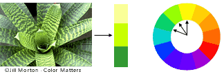
Analogous colors are any three colors which are side by side on a 12 part color wheel, such as yellow-green, yellow, and yellow-orange. Usually one of the three colors predominates.
2. A color scheme based on complementary colors 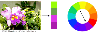
Complementary colors are any two colors which are directly opposite each other, such as red and green and red-purple and yellow-green. In the illustration above, there are several variations of yellow-green in the leaves and several variations of red-purple in the orchid. These opposing colors create maximum contrast and maximum stability.
3. A color scheme based on nature Nature provides a perfect departure point for color harmony. In the illustration above, red yellow and green create a harmonious design, regardless of whether this combination fits into a technical formula for color harmony.

Color ContextHow color behaves in relation to other colors and shapes is a complex area of color theory. Compare the contrast effects of different color backgrounds for the same red square. Red appears more brilliant against a black background and somewhat duller against the white background. In contrast with orange, the red appears lifeless; in contrast with blue-green, it exhibits brilliance. Notice that the red square appears larger on black than on other background colors.
Different readings of the same color
If your computer has sufficient color stability and gamma correction (link to Is Your Computer Color Blind?) you will see that the small purple rectangle on the left appears to have a red-purple tinge when compared to the small purple rectangle on the right. They are both the same color as seen in the illustration below. This demonstrates how three colors can be perceived as four colors.
Observing the effects colors have on each other is the starting point for understanding the relativity of color. The relationship of values, saturations and the warmth or coolness of respective hues can cause noticeable differences in our perception of color.
|
중략
2] design and color
수 많은 경쟁업체와의 싸움에서 이익을 창출하기 위해 디자인이라는 영역은 중요한 역할을 수행하고 있다.
[1] Website
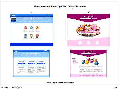
Color Logic for Website Design
Discover and enjoy new design potential with the informed use of color in web design. “Color Logic for Website Design” takes theory to application and provides a solid foundation for color usage in website design, saving time, trouble and rework.
UX web designer and degreed artist Jill Morton explains the basics and then takes you on a clear, concise, rapid-paced and fully-illustrated analysis of color terminology, color harmony, visual effects, and color psychology – specifically for website design.
Newly revised 2016 edition for the wild new world of color and website design
Here are some previews:
Color Harmony
These illustrate how a color harmony formula can be used on the homepage and content pages.
How color is affected by other colors

Do all of the red squares look the same or do they look different?
Learn how to use colors to get attention and for calls to action.
Research reveals people make a subconscious judgment about a person, environment, or product (including a website) within 90 seconds of initial viewing and that between 62% and 90% of that assessment is based on color alone. Source: CCICOLOR – Institute for Color Research
This e-book is a PDF. You can read it it on any tablet, mobile device, or computer.
중략
[2] car design and color


Top 10 Most Popular Car Colors

The pearl white paint of this 2013 Tesla Model S costs an extra $1,500 because it requires multiple layers to create its deep finish. Click the photo to see a slideshow with the full top 10 list of most popular colors for new cars. (Credit: Tesla Motors) In a world full of color, most people prefer black and white—at least when it comes to cars. For a second consecutive year, white is the most popular color for new cars, according to the 2012 DuPont Automotive Color Popularity Report. Black, silver, gray and red round out the top five. “White especially has been a constant top runner since really 1998,” says Nancy Lockhart, DuPont color marketing manager. “Silver had its reign from 2001 to 2006 as being the leading color and now black has come up as being the leading color in certain segments, especially luxury.” Both black and white are seen as denoting status, luxury and quality, she says.
Trends in the electronics industry had a big impact on car colors over the past decade. For example, silver became the color of choice for cell phones, computers and home entertainment systems in the early to mid-2000s. Consequently, it also became a prominent car color. “It was a color that said, ‘Look, I have a modern piece of technology,’” Lockhart says.
Then, in the mid-2000s and beyond, Apple made a splash with white iBooks, iMacs, iPhones and iPods and helped establish white as a hip color of status. Thus, Apple inadvertently helped propel white to prominence in the auto industry. But it’s not just electronics that have an impact on car colors. The use of browns and beiges in home decor is influencing automakers too, Lockhart says. These earthy tones rank as seventh on the list of most popular car colors this year. They account for 5 percent of the automotive market, both globally and in North America. Green is also having a resurgence lately, but still only accounts for 1 percent of the world automotive market and 2 percent in the United States. It ranks ninth in popularity. “Those colors that may be lower popularity, they get the most recognition,” Lockhart says. “More people notice them because all of these neutral colors kind of pass them by—white, black, silver, gray. They kind of go unnoticed now. And some of these lower popularity colors are getting more news.” Still, white, silver, gray and black vehicles vastly outnumber cars of other colors, not just in the United States, but the world over. Collectively, they account for 76 percent of the automotive market. But that could change. “It’s a trend I think people are getting a little tired of, because we’ve had so many of these neutral colors on the road,” Lockhart says.

Benltey offers a vivid hue on its Continental GT Speed called Apple Green. Click the photo to see more new cars in the top 10 most popular colors. (Credit: Bentley) At least they’re getting more interesting with advances in paint technology that allow manufacturers to use multiple layers to create shimmery silvers, three-dimensional blacks and pearly whites. “Colors were more flat 20 or 30 years ago,” Lockhart says. “So we now have a lot more what we call ‘travel,’ where a color looks very bright from one angle and dark from another.” This trend is starting to spread from neutral tones to bright colors, like yellow and gold. Using white primer as a base underneath the paint to make hues of all kinds brighter is another trend on the rise.
DuPont puts together a palette of new colors and presents them to car designers every year at a show for them to mull over and consider incorporating into their lineups. This gives the company insight into what colors consumers will see more of in the future, and Lockhart shared some of the changes that are brewing. “Typically, it takes anywhere from two to four years for a color to be developed and processed. So we really have to think far in advance in order to get these colors into the designers’ hands so they have time to be developed and made for production,” Lockhart says. One area of interest for the auto industry is trying to reinterpret colors associated with fuel-efficient vehicles. The intent is to freshen up the colors, but still connote the idea of being “green.” “When you look at hybrid vehicles at auto shows, you see a lot of bright whites, you see a lot of light blue and maybe some light greens. So we tried to take this a step further and modernize this color group,” Lockhart says. DuPont came up with muted metallic hues that have hints of blue and other cool tones. The new colors also contain varying degrees of metallic flakes. For the luxury segment, DuPont developed a bold bronze and jewel-like green, the latter of which happens to be similar to the emerald color that Pantone, another paint company, recently unveiled as its color of the year for 2013. Unlike DuPont, which focuses on the auto industry, Pantone focuses primarily on the fashion and home decor industries, where its color of the year is seen as a trendsetter. The rankings in DuPont’s Automotive Color Popularity Report are based on production numbers from the automakers. In other words, the number of vehicles manufactured in each color for the 2012 model year determines where on the list that color turns up. Prior to white’s two-year streak in the top spot, silver had been the most popular color for 2010. DuPont announced earlier this year that it will sell its Performance Coatings division to alternative asset manager The Carlyle Group for $4.9 billion in cash. After the sale, expected to close in the first quarter of 2013, Performance Coatings will still develop colors and paint for cars. DuPont will be out of that business, but will continue to develop technologically advanced products for the automotive industry, focusing on lightweight materials, environmentally friendly refrigerants, bio-based seat fabrics, and biofuels.
|
중략
5] medical science and color[spectrum], x-ray
color에 대한 관심이 의학에 까지 적용되어 인간의 건강한 삶을 꾸릴 수 있도록 도와주고 있다. spectrum이 발단이 되어 인간의 문명의 이기는 더욱 발전하고 있다. 학생들에게 color에 대한 인식의 폭을 넓혀주어 더욱 혁신적이고 창조적 사고를 할 수 있도록 해야 한다.

X-radiation (composed of X-rays) is a form of electromagnetic radiation. Most X-rays have a wavelength ranging from 0.01 to 10 nanometers, corresponding to frequencies in the range 30 petahertz to 30 exahertz (3×10¹⁶ Hz to 3×10¹⁹ Hz) and energies in the range 100 eV to 100 keV. X-ray wavelengths are shorter than those of UV rays and typically longer than those of gamma rays. In many languages, X-radiation is referred to with terms meaning Röntgen radiation, after Wilhelm Röntgen,[1] who is usually credited as its discoverer, and who had named it X-radiation to signify an unknown type of radiation.[2] Spelling of X-ray(s) in the English language includes the variants x-ray(s), xray(s), and X ray(s).[3] X-rays with high photon energies (above 5–10 keV, below 0.2–0.1 nm wavelength) are called hard X-rays, while those with lower energy are called soft X-rays.[4] Due to their penetrating ability, hard X-rays are widely used to image the inside of objects, e.g., in medical radiography and airport security. The term X-ray is metonymically used to refer to a radiographic image produced using this method, in addition to the method itself. Since the wavelengths of hard X-rays are similar to the size of atoms they are also useful for determining crystal structures by X-ray crystallography. By contrast, soft X-rays are easily absorbed in air; the attenuation length of 600 eV (~2 nm) X-rays in water is less than 1 micrometer.[5] There is no consensus for a definition distinguishing between X-rays and gamma rays. One common practice is to distinguish between the two types of radiation based on their source: X-rays are emitted by electrons, while gamma rays are emitted by the atomic nucleus.[6][7][8][9] This definition has several problems: other processes also can generate these high-energy photons, or sometimes the method of generation is not known. One common alternative is to distinguish X- and gamma radiation on the basis of wavelength (or, equivalently, frequency or photon energy), with radiation shorter than some arbitrary wavelength, such as 10−11 m (0.1 Å), defined as gamma radiation.[10] This criterion assigns a photon to an unambiguous category, but is only possible if wavelength is known. (Some measurement techniques do not distinguish between detected wavelengths.) However, these two definitions often coincide since the electromagnetic radiation emitted by X-ray tubes generally has a longer wavelength and lower photon energy than the radiation emitted by radioactive nuclei.[6] Occasionally, one term or the other is used in specific contexts due to historical precedent, based on measurement (detection) technique, or based on their intended use rather than their wavelength or source. Thus, gamma-rays generated for medical and industrial uses, for example radiotherapy, in the ranges of 6–20 MeV, can in this context also be referred to as X-rays
생략
|
6] LED
중략
9] fractal geometry
중략
10] regenerative medicine [techniques] 재생의학
잘리면 다시 자라는 도마뱀 꼬리처럼 인간도 신체기관이 그렇게 되기를 소망하고 있지 않나?
[1] bio-ink and 3-D printer
Bio-ink is a material made from living cells that behaves much like a liquid, allowing people to "print" it in order to create a desired shape. This material was developed by researchers at the University of Missouri, Columbia, with the goal of someday being able to do things like print replacements for failing organs. This technology is only in the very early stages of testing and development, but it shows promise. To make bio-ink, scientists create a slurry of cells that can be loaded into a cartridge and inserted into a specially designed printer, along with another cartridge containing a gel known as bio-paper. After inputting the standards for the thing they want to print, the researchers trigger the printer, and the cartridges alternate layers to build a three dimensional structure, with the bio-paper creating a supportive matrix that the ink can thrive on. Through a process that is not yet totally understood, the individual droplets fuse together, eventually latticing upwards through the bio-paper to create a solid structure. Understanding this process and the point at which cells differentiate to accomplish different tasks is an important part of creating a usable material; perhaps someday hospitals will be able to use it to generate tissue and organs for use by their patients.
The most obvious potential use for bio-ink is in skin grafting. With this technology, labs could quickly create sheets of skin for burn victims and other people who might be in need of grafts. By creating grafts derived from the patient's own cells, it could reduce the risk of rejection and scarring. Bio-ink could also be used to make replacements for vascular material removed during surgeries, allowing people to receive new veins and arteries. Eventually, entire organs could be constructed from this material. Since organs are in short supply around the world, bio-ink could potentially save untold numbers of lives, as patients would no longer have to wait on the transplant list for new organs. The use of such organs could also allay fears about contaminated organ supplies or unscrupulous organ acquisition methods.
|
중략
이하 생략
위의 공개자료는 정원장이 어떤 기관에 제출해야하는 무슨 보고서나 논문이 절대 아닙니다. 회원 여러분들에게 자료을 공개하려 하다보니 체계가 필요해서 만든l layout에 따라 서술할 뿐입니다. 어떤 특정학문의 영역을 반박하거나 옹호할 생각도 전혀 없습니다. 있는 그대로, 알려진 그대로 적을 뿐입니다. 그리고 대한민국의 영어라는 교육과목이 무엇을 할 수 있을지에 대한 고민의 결과들일 뿐입니다. '왜 공부하는가?'라고 학생들에게 질문해서 그들의 답을 들어 본 교사나 강사들이라면 반드시 명심해야 할 부분을 교육자들은 잊고 있지 않은가! 학생들은 궁극적으로 행복해지기 위해서 공부한다. 공부가 학생들의 미래에 도움이 안된다면 그 가치가 실로 감소할 수 밖에 없다.
대입이라는 제도가 어느 때부터 '교과서에 충실하라, 학교공부 열심히 하면된다.'라고 말도 안되는 잘못된 함정을 만들어 놓았다. 학생들을 교과서 속에서만 학습라는 길을 가는 거북이로 만들어서는 안된다. 다른 나라 학생들은 토끼처럼 뛰어 가는데[우화속 자만에 빠져 잠자는 토끼와 쉬지도 못하고 죽도록 경주를 하는 부지런한 거북이라는 틀로만 보지 말라.] 참 오랜 기간 언론에서는 대입시험 고득점자들의 비결을 '학교수업에 충실했다.'는 둥의 거짓말을 하게 만들었다. 아니 언론이 거짓말을 한 것이 명백할 것이다. 학교에서 가르치는 것만으로는 대한민국의 미래를 걸머질 동량으로 키울 수가 없다. 이제 우리는 대한민국에 학생들을 보호하고 사회를 보호하기 위해 만들어 놓은 많은 법, 도덕 등의 규제가 지식의 습득과 발전에 장애가 되고 있는 것은 아닌지 숙고해야 한다.
영문지문들은 영어학습의 중요한 자료들 입니다. 문제출제의 자료가 될 수도 있습니다.
color와 관련한 전체 지문의 분량도 엄청 많습니다. 무엇을 공개할지에 대한 취사선택도 쉬운 일이 아닙니다. 최고의 교육을 지향하는 분들을 위한 know-how는 어느정도 비공개되어야 하는 부분이 필요하다고 생각되고. 공개하는 부분내에서 일반회원들의 (영어)교육과 학습에 대한 생각에 변화를 가져올 수 있다면 만족해야 할 것이라고 생각됩니다.
특별회원 이상의 회원이 되시면 훨씬 풍부한 자료를 만끽하실 수 있습니다. 더 깊이 있는 과학적 자료들은 공개에서 배제한 상태입니다. 사실은 그 부분이 미래의 먹거리이고 교육이 지향해 가야할 궁극의 목표일지도 모릅니다. 행복을 위한 도구의 하나인 '돈'이 얻어지는 곳이니. 그러나 회원 여러분의 관심, 흥미가 정원장영어가 목표로 하는 바와 함께 한다면 그러한 목적은 이루어질 것을 믿습니다.
대학은 상아탑의 철학에 매몰되어 미래의 희망이라는 씨를 심는데 소홀히 해서는 안된다. 대학관계자들도 학부모나 학생들의 등골을 빼먹는 구닥다리 철학을 고집하는 것으로는 절대 책임을 다하는 도리가 아니다. 실용이 가능하도록하는 교육에 더욱 정진할 필요가 있다. 그래야 졸업생의 미래뿐 아니라 사회, 국가의 미래도 보장받을 수 있다.
정원장영어[http://cafe.daum.net/EnglishJung]와 함께 행복한 미래를 여는 영어교육을 하세요^^


.jpg)


_W_IMG_2440.jpg)
.jpg)
.jpg)


.jpg)