|
WPF Panel |
작성자 : 최현식 |
|
작성일 : 2011. 4.12 | |
|
제목 : WPF Panel | |
1. WPF Layout
- Layout이라는 용어는 Panel요소의 Children컬렉션에 속한 멤버를 측정 및 정렬한 다음 화면에 그리는 프로세스를 말한다.
- 고정 위치 모델 (Fixed Position Model) : 절대 좌표를 이용하여 컨트롤 위치를 배치
- 동적 위치 모델 (Dynamic Position Model) : 윈도우의 크기가 변해도 자동적으로 Layout과 Control의 크기와 위치 따라 변경
2. Panel
- 자신이 소유한 요소들을 정렬하는 일을 수행하는 목적을 가진 사용자 Interface로서 크기 및 차원, 위치, 자식 콘텐츠 정렬 등과 같은 요소 렌더링을 제어하는 구성 요소이다.
3. Panel 클래스
- WPF에서 Layout지원을 제공하는 모든 요소에 대한 기본 클래스이다.
- 파생 Panel요소는 XAML 및 코드에서 요소를 배치하고 정렬하는 데 사용된다.
4. Panel의 공용멤버
- 모든 Panel요소는 Height, Width, HorizontAlignment, VerticalAlignment, Margin 및 LayoutTransfrom을 비롯하여 FrameworkElement로 정의되는 기본 크기 조정 및 배치 속성을 지원한다.
5. 파생 Panel 요소
5.1. UI패널 여부가 있는 경우 (UI element보관 할 수 있는 컬렉션 있는 경우)
|
패널 타입 |
설명 |
|
Canvas |
Canvas 영역에 상대적인 좌표를 사용하여 자식 요소를 명시적으로 배치할 수 있는 영역을 말한다. |
|
DockPanel |
자식 요소를 서로에 상대적으로 가로나 세로로 정렬할 수 있는 영역을 정의한다. |
|
Grid |
열과 행으로 구성되는 유연한 표 영역을 정의한다. Grid의 자식 요소는 Margin속성을 사용하여 정확한 위치를 지정할 수 있다. |
|
StackPanel |
자식 요소를 가로 또는 세로 방향으로 지정할 수 있는 단일 선에 따라 정렬한한다. |
|
WrapPanel |
WrapPanel은 자식 요소를 왼쪽에서 오른쪽으로 순차적으로 배치하고, 포함하는 상자의 가장자리에 내용을 다음 줄로 바꾼다. Orientation 속성 값에 따라 순서가 위쪽에서 아래쪽으로 또는 오른쪽에서 왼쪽으로 순차적으로 지정된다. |
|
VirtualizingStackPanel |
가로 또는 세로 방향으로 지정된 한 줄에 콘텐츠를 정렬하고 가상화한다. |
5.2. UI패널 여부가 없는 경우 (UI element보관 할 수 있는 컬렉션 없는 경우)
|
패널 타입 |
설명 |
|
TabPanel |
TabControl에 있는 탭 단추의 레이아웃을 처리한다. |
|
ToolBarOverflowPanel |
ToolBar컨트롤 내의 콘텐츠를 정렬한다. |
|
UniformGrid |
UniformGrid는 셀 크기가 모두 동일한 표에 자식을 정렬하는 데 사용된다. |
|
VirualizingPanel |
해당 자식 컬렉션을 “가상화”할 수 있는 패널에 대한 기본 클래스를 제공한다. |
6. Panel 종류
6.1. Canvas
- Canvas요소를 사용하면 x좌표 및 y좌표에 따라 콘텐츠의 위치를 지정할 수 있다.
- 모든 Panel중 가장 유연한 Layout지원을 제공한다.(하지만 Canvas를 되도록 사용하지 않는게 좋다)
- Height 및 Width속성은 Canvas의 영역을 정의하는 데 사용되며 내부 요소에는 부모 Canvas의 영역에 상대적으로 좌표가 할당된다.
- left, right, top, bottom을 사용하면 canvas내에서의 개체 배치를 자세히 제어할 수 있으며 화면에서 요소를 정확하게 배치 및 정렬할 수 있다.
6.1.1 Canvas C#
|
// Create the Canvas Canvas myParentCanvas = new Canvas(); // Canvas 생성 myParentCanvas.Width = this.Width;// 요소의 제안된 높이를 가져오거나 설정.(frameworkElement 상속됨) myParentCanvas.Height = this.Height; // 요소의 너비를 가져오거나 설정.(frameworkElement 상속됨)
// Define child Canvas elements Canvas myCanvas1 = new Canvas(); myCanvas1.Background = Brushes.Red; // Panel 테두리 사이의 영역을 채우는 데 사용되는 Brush를 가져오거나 설정(Panel 상속됨) myCanvas1.Height = 100; myCanvas1.Width = 100; Canvas.SetTop(myCanvas1, 10); // 지정된 종속성 개체의 Canvas.Top 연결된 속성 값을 설정 Canvas.SetLeft(myCanvas1, 10); // 지정된 종속성 개체의 Canvas.Left 연결된 속성 값을 설정
// Add child elements to the Canvas' Children collection myParentCanvas.Children.Add(myCanvas1); // 이 Panel 자식 요소의 UIElementCollection을 가져옵니다. (Panel에서 상속됨) Content = myParentCanvas; // 출력 |
6.1.2. Canvas XAML
|
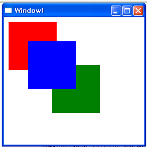
<Page WindowTitle="Canvas Sample" xmlns="http://schemas.microsoft.com/winfx/2006/xaml/presentation"> <Canvas Height="400" Width="400"> <Canvas Height="100" Width="100" Top="0" Left="0" Background="Red"/> <Canvas Height="100" Width="100" Top="100" Left="100" Background="Green"/> <Canvas Height="100" Width="100" Top="50" Left="50" Background="Blue"/> </Canvas> </Page> |
|
출력 결과 |
|
|
6.2. DockPanel
- DockPanel요소는 자식 콘텐츠 요소에 설정된 DockPanel.Dock연결된 속성을 사용하여 컨테이너의 가장자리를 따라 콘텐츠를 배치한다.
- Top, Bottom으로 설정하면 자식 요소가 서로의 위 또는 아래에 배치되고, Left, right로 설정하면 자식 요소가 서로의 왼쪽 또는 오른쪽에서 배치된다.
6.2.1. LastChildFill
- 기본적으로 DockPanel요소의 마지막 자식이 할당되지 않은 나머지 공간을 “채운다”. 이러한 동작이 필요 없는 경우 LastchildFill속성을 false로 설정한다.(채울경우 true)
6.2.2. DockPaenl C#
|
DockPanel myDockPanel = new DockPanel(); // DockPanel 생성 myDockPanel.LastChildFill = false; // true 남은 영역을 false일경우 해당 부분만.
// Define the child content Border myBorder1 = new Border(); // 다른 요소 주위에 테두리 또는 배경을 그리거나 테두리와 배경을 모두 그립니다. myBorder1.Height = 25; // 요소의 제안된 높이를 가져오거나 설정 (FrameworkElement에서 상속됨) myBorder1.Background = Brushes.SkyBlue; // Panel 테두리 사이의 영역을 채우는 데 사용되는 Brush를 가져오거나 설정 (Panel에서 상속됨) myBorder1.BorderBrush = Brushes.Black; // 외부 테두리 색을 그리는 Brush를 가져오거나 설정 myBorder1.BorderThickness = new Thickness(1); //Border의 상대 Thickness를 가져오거나 설정 (두께) DockPanel.SetDock(myBorder1, Dock.Top); TextBlock myTextBlock1 = new TextBlock(); // 적은 분량의 텍스트를 표시할 가벼운 컨트롤을 제공 myTextBlock1.Foreground = Brushes.Black; // TextBlock 의 텍스트 콘텐츠에 적용할 Brush를 가져오거나 설정 myTextBlock1.Text = "Dock = Top"; myBorder1.Child = myTextBlock1; |
6.2.3. DockPanel Xaml
|
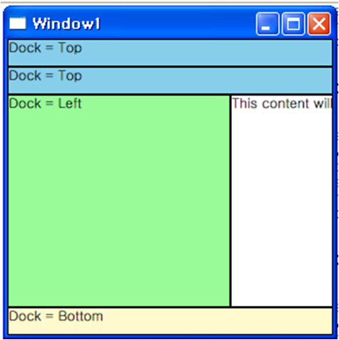
<Page xmlns="http://schemas.microsoft.com/winfx/2006/xaml/presentation" WindowTitle="DockPanel Sample"> <DockPanel LastChildFill="True"> <Border Height="25" Background="SkyBlue" BorderBrush="Black" BorderThickness="1" DockPanel.Dock="Top"> <TextBlock Foreground="Black">Dock = "Top"</TextBlock> </Border> <Border Height="25" Background="SkyBlue" BorderBrush="Black" BorderThickness="1" DockPanel.Dock="Top"> <TextBlock Foreground="Black">Dock = "Top"</TextBlock> </Border> <Border Height="25" Background="LemonChiffon" BorderBrush="Black" BorderThickness="1" DockPanel.Dock="Bottom"> <TextBlock Foreground="Black">Dock = "Bottom"</TextBlock> </Border> <Border Width="200" Background="PaleGreen" BorderBrush="Black" BorderThickness="1" DockPanel.Dock="Left"> <TextBlock Foreground="Black">Dock = "Left"</TextBlock> </Border> <Border Background="White" BorderBrush="Black" BorderThickness="1"> <TextBlock Foreground="Black">This content will "Fill" the remaining space</TextBlock> </Border> </DockPanel> </Page> |
|
출력 결과 |
|
|
6.3. StackPanel
- StackPanel을 사용하면 요소를 할당된 방향으로 “쌓을” 수 있습니다. 기본 스택 방향은 수직입니다. Orientation 속성을 사용하면 콘텐츠의 흐름을 제어할 수 있습니다.
6.3.1. StackPanel C#
|
StackPanel myStackPanel = new StackPanel(); // 스택 패널 개체 생성 myStackPanel.HorizontalAlignment = HorizontalAlignment.Left; myStackPanel.VerticalAlignment = VerticalAlignment.Top;
// Define child content Button myButton1 = new Button(); myButton1.Content = "Button 1"; Button myButton2 = new Button(); myButton2.Content = "Button 2"; Button myButton3 = new Button(); myButton3.Content = "Button 3";
// Add child elements to the parent StackPanel myStackPanel.Children.Add(myButton1); myStackPanel.Children.Add(myButton2); myStackPanel.Children.Add(myButton3);
Content = myStackPanel; |
6.3.2. StackPanel Xaml
|
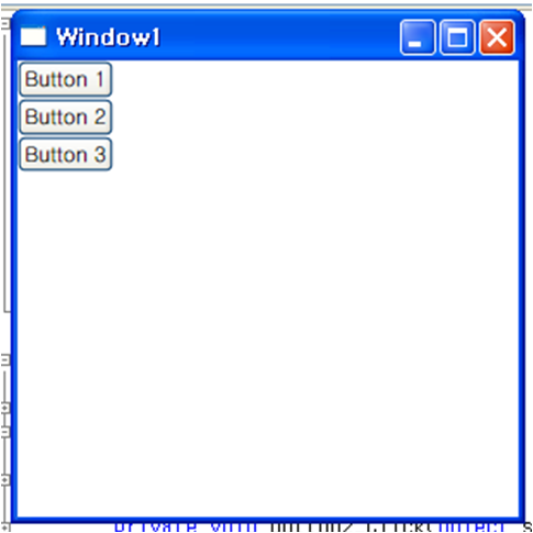
<Page xmlns="http://schemas.microsoft.com/winfx/2006/xaml/presentation" WindowTitle="StackPanel Sample"> <StackPanel HorizontalAlignment="Left" VerticalAlignment="Top"> <Button>Button 1</Button> <Button>Button 2</Button> <Button>Button 3</Button> </StackPanel> </Page> |
|
출력 결과 |
|
|
6.4. WrapPanel
- WrapPanel은 자식 요소를 왼쪽에서 오른쪽으로 순차적으로 배치하고, 해당 부모 컨테이너의 가장자리에 도달할 경우 내용을 다음 줄로 바꾸는 데 사용된다.
- 콘텐츠는 가로 또는 세로 방향으로 설정할 수 있다.
6.4.1. WrapPanel C#
|
WrapPanel myWrapPanel = new WrapPanel(); myWrapPanel.Background = System.Windows.Media.Brushes.Azure; myWrapPanel.Orientation = Orientation.Vertical; // 자식 콘텐츠가 정렬되는 방향을 지정하는 값을 가져오거나 설정합니다. myWrapPanel.Width = 200; myWrapPanel.HorizontalAlignment = HorizontalAlignment.Left; myWrapPanel.VerticalAlignment = VerticalAlignment.Top;
Button btn1 = new Button(); btn1.Content = "Button 1"; btn1.Width = 200; Button btn2 = new Button(); btn2.Content = "Button 2"; btn2.Width = 75; Button btn3 = new Button(); btn3.Content = "Button 3"; btn3.Width = 75; Button btn4 = new Button(); btn4.Content = "Button 4"; btn4.Width = 75; // Add the buttons to the parent WrapPanel using the Children.Add method. myWrapPanel.Children.Add(btn1); myWrapPanel.Children.Add(btn2); myWrapPanel.Children.Add(btn3); myWrapPanel.Children.Add(btn4);
Content = myWrapPanel; |
6.4.2. WrapPanel Xaml
|
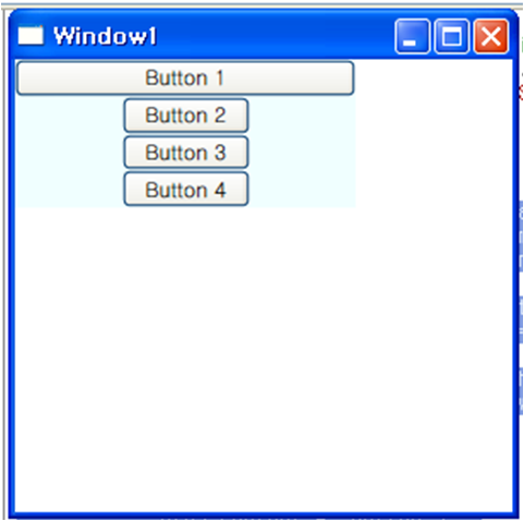
<Page xmlns="http://schemas.microsoft.com/winfx/2006/xaml/presentation" WindowTitle="WrapPanel Sample"> <Border HorizontalAlignment="Left" VerticalAlignment="Top" BorderBrush="Black" BorderThickness="2"> <WrapPanel Background="LightBlue" Width="200" Height="100"> <Button Width="200">Button 1</Button> <Button>Button 2</Button> <Button>Button 3</Button> <Button>Button 4</Button> </WrapPanel> </Border> </Page> |
|
출력 결과 |
|
|
6.5. Grid
- Grid요소는 절대 위치 지정 컨트롤과 표 형식 데이터 컨트롤의 기능을 병합한다.
- Grid를 사용하면 요소의 위치와 스타일을 쉽게 지정할 수 있다.
- Grid는 유연한 행 및 열 그룹화를 정의할 수 있도록 하며 여러 Grid요소 간에 크기 정보를 공유할 수 있는 매커니즘도 제공한다.
6.5.1. 열 및 행의 크기 조정 동작
- Grid 내에 정의된 열 및 행에 대해 star 크기 조정을 활용하여 나머지 공간을 비례적으로 나눌 수 있다.
- star를 행이나 열의 Height 또는 Width로 선택하면 사용 가능한 나머지 공간의 가중 크기가 해당 열이나 행에 할당된다.
- Stretch의 HorizontalAlignment 및 VerticalAlignement값으로 공간을 비율에 따라 배분하는 방법을 결합하면 레이아웃 공간을 화면 공간의 백분율에 따라 나눌 수 있다.
6.5.2. Grid C#
|
Grid grid1 = new Grid(); // Grid 개체 생성 grid1.Background = Brushes.Gainsboro; // Panel 테두리 사이의 영역을 채우는 데 사용되는 Brush를 가져오거나 설정 (Panel에서 상속됨) grid1.HorizontalAlignment = HorizontalAlignment.Right; //이 요소를 패널 또는 항목 컨트롤 등의 부모 요소에서 작성하는 경우 요소에 적용되는 가로 맞춤 특성을 가져오거나 설정 (FrameworkElement에서 상속됨) grid1.VerticalAlignment = VerticalAlignment.Top; // 이 요소를 패널 또는 항목 컨트롤 등의 부모 요소에서 작성하는 경우 요소에 적용되는 세로 맞춤 특성을 가져오거나 설정 (FrameworkElement에서 상속됨) grid1.ShowGridLines = true; // 이 Grid 내에 모눈선이 표시되는지 여부를 나타내는 값을 가져오거나 설정 grid1.Width = this.Width; grid1.Height = this.Height;
// Define the Columns. Grid 요소에 적용되는 열별 속성을 정의 // ColumnDefinition, GridLength, RowDefinition은 너비를 동적으로 설정하는 방법 // Auto : 콘텐츠 개체의 크기 속성에 따라 크기가 결정된다. // Pixel : 값을 픽셀 단위로 나타냄 // Star : 값을 사용 가능한 공간에 대한 가중치로 나타냄. ColumnDefinition colDef1 = new ColumnDefinition(); // Grid 요소에 적용되는 열별 속성을 정의한다. colDef1.Width = new GridLength(1, GridUnitType.Auto); ColumnDefinition colDef2 = new ColumnDefinition(); colDef2.Width = new GridLength(1, GridUnitType.Star); grid1.ColumnDefinitions.Add(colDef1); grid1.ColumnDefinitions.Add(colDef2);
// Define the Rows. RowDefinition rowDef1 = new RowDefinition(); rowDef1.Height = new GridLength(1, GridUnitType.Auto); RowDefinition rowDef2 = new RowDefinition(); rowDef2.Height = new GridLength(1, GridUnitType.Auto); grid1.RowDefinitions.Add(rowDef1); grid1.RowDefinitions.Add(rowDef2); // Add the main application dialog. TextBlock txt1 = new TextBlock(); txt1.Text = "Type the name of a program, folder, document, or Internet resource, and Windows will open it for you."; txt1.TextWrapping = TextWrapping.Wrap; // TextBlock 의 텍스트가 줄 바꿈되는 방법을 가져오거나 설정. Grid.SetColumnSpan(txt1, 4); // 지정된 UIElement에 ColumnSpan 연결된 속성 값을 설정. Grid.SetRow(txt1, 0); // 지정된 UIElement에 Row 연결된 속성 값을 설정. Grid.SetColumn(txt1, 1); // 지정된 UIElement에 Column 연결된 속성 값을 설정. |
6.5.3. Grid Xaml
|
<Page xmlns="http://schemas.microsoft.com/winfx/2006/xaml/presentation" WindowTitle="Grid Run Dialog Sample" WindowWidth="425" WindowHeight="225"> <Grid Background="#DCDCDC" Width="425" Height="165" HorizontalAlignment="Left" VerticalAlignment="Top" ShowGridLines="True"> <Grid.ColumnDefinitions> <ColumnDefinition Width="Auto" /> <ColumnDefinition Width="*" /> <ColumnDefinition Width="*"/> <ColumnDefinition Width="*"/> <ColumnDefinition Width="*"/> </Grid.ColumnDefinitions> <Grid.RowDefinitions> <RowDefinition Height="Auto" /> <RowDefinition Height="Auto" /> <RowDefinition Height="*" /> <RowDefinition Height="Auto" /> </Grid.RowDefinitions>
<Image Grid.Column="0" Grid.Row="0" Source="RunIcon.png" /> <TextBlock Grid.Column="1" Grid.ColumnSpan="4" Grid.Row="0" TextWrapping="Wrap"> Type the name of a program, folder, document, or Internet resource, and Windows will open it for you. </TextBlock> <TextBlock Grid.Column="0" Grid.Row="1">Open:</TextBlock> <TextBox Grid.Row="1" Grid.Column="1" Grid.ColumnSpan="5" /> <Button Margin="10, 0, 10, 15" Grid.Row="3" Grid.Column="2">OK</Button> <Button Margin="10, 0, 10, 15" Grid.Row="3" Grid.Column="3">Cancel</Button> <Button Margin="10, 0, 10, 15" Grid.Row="3" Grid.Column="4">Browse ...</Button> </Grid> </Page> |
|
출력 결과 |
|
|

 WPF Panel기술문서.docx
 panel1.exe